Thrive in Design
Thrive in Design needed a more cohesive social presence to support its podcast content and overall brand visibility. While the existing posts communicated the right information, the visuals varied across formats and lacked a unified system. I refreshed the social templates to create a more consistent, polished, and scalable design approach across static posts, quote graphics, and promotional content.
The challenge
The existing social assets were inconsistent from post to post. Typography, color usage, layout, and content hierarchy varied across formats, which made the brand less recognizable and polished as a whole.
My role
I led the visual refresh of the company’s social templates, reworking the design system across key content types. This included refining layout structure, typography, color consistency, image treatment, and call-to-action elements to create a more unified set of assets.
The solution
The updated system introduced a more consistent structure across social assets while still allowing flexibility for different content types. The refreshed templates featured:
More cohesive use of brand color
Clearer typographic hierarchy
More consistent placement of imagery and supporting elements
Stronger CTA treatment
Cleaner and more repeatable layout system
Together, these changes helped transform the social presence from a collection of individual posts into a more connected brand experience.
Outcome
The result was a more cohesive and scalable social template system that gave the brand a stronger visual presence online. The refresh created a clearer foundation for future content and made it easier to maintain consistency across ongoing social promotion.
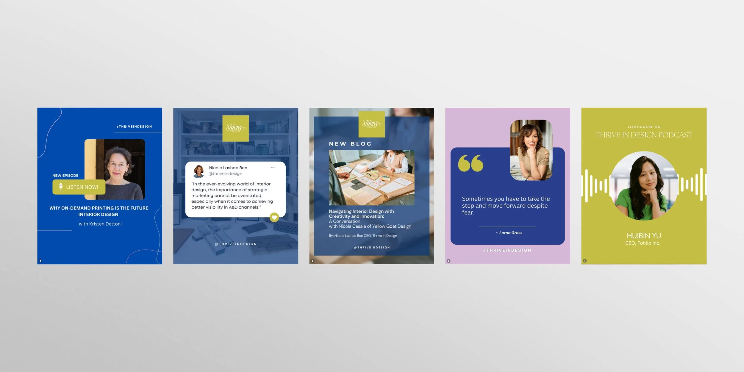
Before
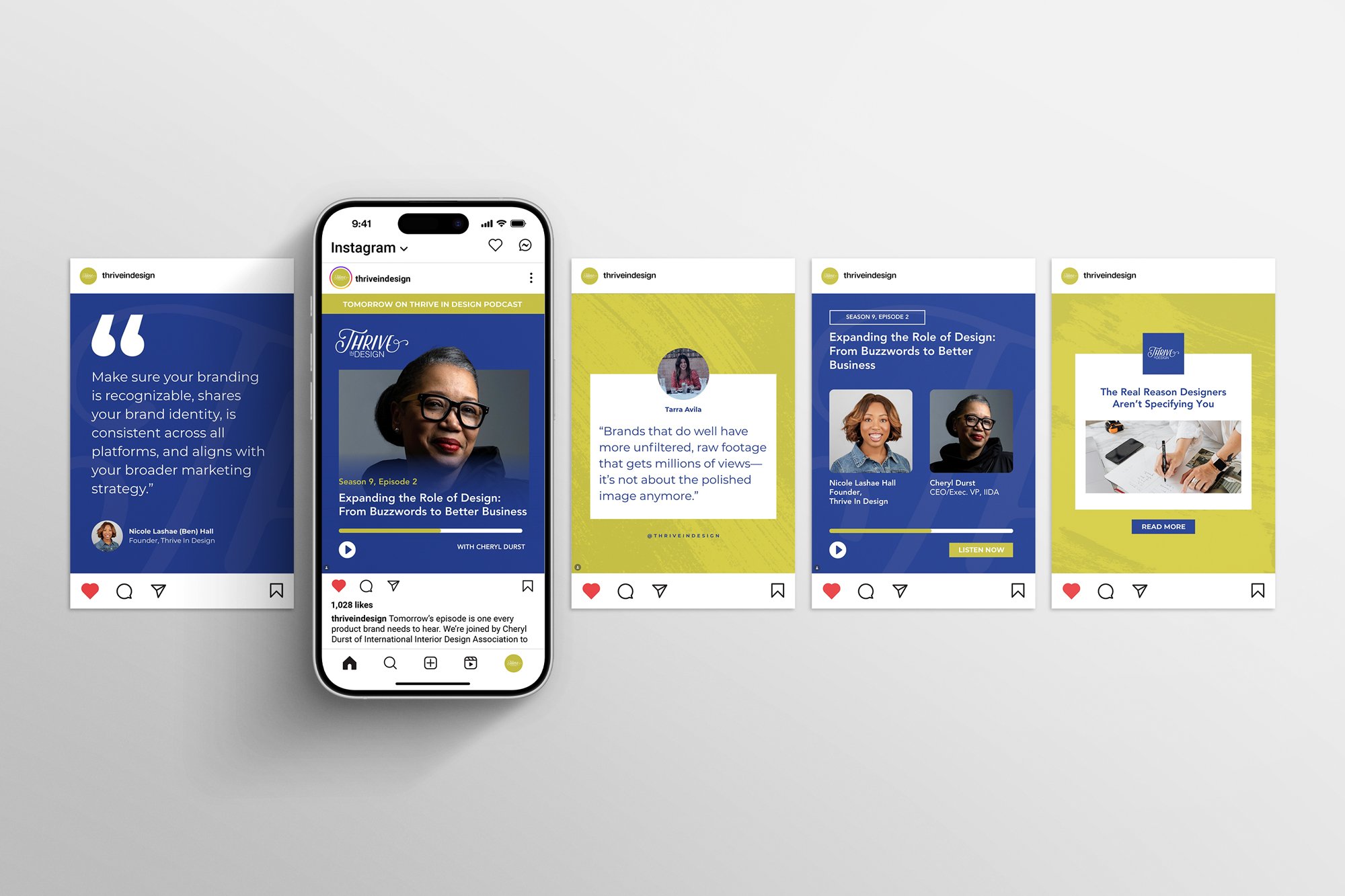
After